- System x Human x Machine
- Posts
- Context is key: A new era of design systems
Context is key: A new era of design systems
How to prepare your system for a new level of scale
Lewis Healey
February 13, 2026 • Reading time: 4 minutes
Not every article is going to be about AI 🤖, I promise, but I’ve seen a lot of surface-level versions of this topic across the internet so I wanted to double click into it personally and show why it’s the most crucial thing to do right now.
If you’re already working on context then great, if not, hopefully I’ve convinced you to get this on your roadmap.
Lewis x
🔑 Key takeaways
Your design system now serves AI agents and adaptive interfaces, not just designers and engineers
Documentation sprawl across tools creates maintenance hell and blocks AI integration
A single source of context beats multiple destinations: update once, distribute everywhere
Structured context unlocks MCPs, agents, and tooling without rebuilding everything from scratch
Start with design tokens and one component to prove the value before scaling
The winning design systems won't have the most components, they'll have the smartest context
I’ll be honest, I’ve been skeptical of a lot of AI hype in our industry. Every week there’s a new tool promising to “revolutionize design systems” or “eliminate handoff friction forever.” Most of it feels like noise. But there’s one shift that doesn’t feel like hype at all, it feels foundational. And if we don’t prepare for it, our design systems risk becoming relics of a pre-AI era.

Your remit has changed
Your design system isn’t just for designers and engineers anymore. It’s for AI agents, adaptive interfaces, and systems that compose experiences on the fly. Think about it, designers and engineers are a finite group of people using your components in somewhat predictable ways. But AI? AI can generate thousands of variations, compose layouts you never imagined, and create adaptive experiences that respond to user context in real-time.
Your Button component isn’t just being dropped into a sign-up flow by a designer anymore, It’s being selected by an AI agent building a personalized onboarding experience for a specific user segment.
Your Modal isn’t just in your component library, it’s being composed with your Card and Form components in combinations you never documented because an adaptive system determined that’s what this particular user needs right now.
Why context is important
Everyone and everything is now a potential consumer of your components, and if your context (the way you document your foundations, components, patterns etc) isn’t structured, queryable, and accessible to machines, you’re going to struggle to create cohesive, usable experiences at this new scale.
Current challenges with context
Most organisations will have sparse design system context: documentation lives in your NextJS/Gatsby site, component guidelines sit in Figma, API references hide in Storybook, code examples are buried in GitHub repos - you get the picture. At Atlassian, we had five separate places where Button was documented!
And now, with AI agents entering the chat, you’re expected to power MCP servers, support LLM integrations, and enable agentic workflows, all while maintaining everything individually.
This fragmentation isn’t just inefficient, It’s actively holding back your design system’s potential in an AI-first world.
One source, many distributions
Documentation should converge into a single destination, generated by code - that powers everything now and in the future. This isn’t hype. This is the foundation of the next evolution of design systems.
When you have a single source of truth for your design system context, you make it easy to manage, maintain and iterate. Need to add a new appearance to your Badge component? Everything can update in unison: You documentation website will update, MCP will consume last changes and any tooling can leverage the new appearance.
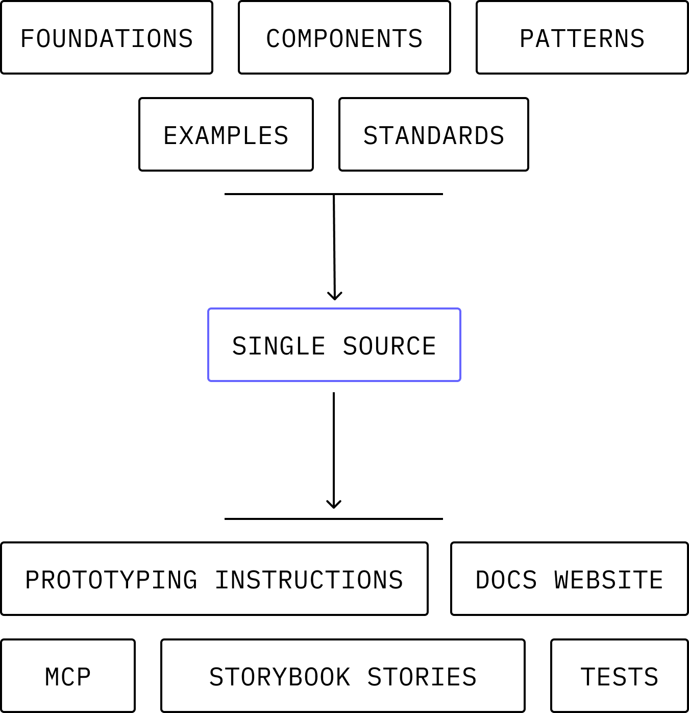
Example inputs and outputs of a single source
How do create a source of context
It really depends on the complexity of your tech stack and where your context lives, but in most cases:
Create the object per element: a json object would suffice. You can call it whatever you like but I like the term
context-manifest.json. This manifest will contain all code examples, metadata, package info and guidelines for that design system element (see below)
p.s you should try and make these files auto generated from code 🤖

Example JSON data - see full file
Include manifest component folder: Best practice is to include the file within each component folder so everything is housed nicely,
/design-system/button/component-manifest.jsonas an exampleFind a way to transform the files into artefacts: Creating structured content for context across your design system may be more challenging than you think. Its best to get content and engineering involved early as there may be some things to think about when generating artefacts, versioning them and pushing updates.
You’re now good to go!
Where to distribute your context
Once you have your source of truth you can essentially power anything you can put resource or your mind to, as long as it has a way of retrieving the latest information. Some ideas for you:
A Figma docs plugin
Your own design system MCP
Prototyping template instructions
Storybook files
Tests
Various agents
Your documentation website
The world is truly your oyster when it comes to using this single source of truth. You can even extend the manifest schema to non-design system components and have a unified system documented in a consistent way - this makes plugging in components to AI extremely easy and scalable.
📅 What you can do today
Audit your current documentation - List everywhere you maintain component information. Understanding the full scope of your sprawl is step one. Start with design tokens
Move your design tokens to a structured format like the W3C Design Tokens Community Group spec. This is the easiest win. Choose one component to unify
Pick Button and map out everything you know about it: props, variants, usage guidelines, code examples, related components. See how much knowledge is currently scattered.
🎯 What you can do this quarter
Define your context schema - What information do you need to capture for each component? Start simple. Focus on attributes that would unlock the most value if they were structured and queryable. Build buy-in with a proof of concept
Take that Button and create structured context for it. Then build one simple thing from it—a script that generates a docs page or a Figma plugin that validates usage. Show your team the leverage.
Involve the whole team early - Engineers, designers, and content strategists all need to contribute. Make it part of your component development workflow from the start.
Final thoughts
The beauty of this approach? It's not another redesign or migration project that'll take six months and break everything. It's iterative. It's additive. And honestly, once you see it working, once you watch a single source of context power your docs, your MCP, and your Figma plugin simultaneously, you'll wonder how you ever managed the old way.
We're building this at Atlassian right now. It's messy. It's challenging. But it's also the most excited I've been about the future of design systems in years.
The AI era isn't coming, it's here. Let's make sure our design systems are ready for it.
Reply